The worst Microsoft product ever

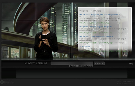
Microsoft makes a lot of terrible products. But the new Microsoft search site, Ms. Dewey, tops them all. It's the worst Microsoft product ever.
This site is supposed to be a search engine. How many ways does it fail?
- Ms. Dewey takes what seems to be an excruciating 15, 20 seconds to load. And this is before you get the "skip intro" option.
- The contrast between the black background and the charcoal gray type is so minimal that you can't read a thing. That's probably just as well for Bill Gates, since one of the things you can't read is "© 2006, Microsoft Corp."
- The search results are powered by Microsoft's Live Search. Supposedly Microsoft is letting Ms. Dewey get discovered "naturally" as a way of promoting Live Search. Let's just say that Google has nothing to fear.
- I'll go further. The show is so annoying that you have to assume that this is Microsoft's way of covering up Live's lame search engine.
- To the extent the search results have any value, you'll never find out. Just try to read them, let alone scroll down.
- This exercise in coding is an inexcusably self-indulgent abuse of Macromedia Flash technology. There is a rather scandalous term for this. If you insist, you may consult Wikipedia or Urban Dictionary for the term. But don't say I didn't warn you.
- Through the magic of linking, I'm referring Microsoft's abusive perpetuation of negative female stereotypes to Feminist Law Professors. Ann Bartow is going to have a field day with this.
 The entire project has to be a blow to the acting career of Janina Gavankar, who has been compared to Jessica Alba. Ugh. More like Fallen Angel than Dark Angel.


4 Comments:
This comment has been removed by a blog administrator.
This comment has been removed by a blog administrator.
This comment has been removed by a blog administrator.
Pathetic. You that kind of person, who hate everything belongs to Microsoft, because it is manufactured by Microsoft. You cry about usability, when it is a joke.
Post a Comment
<< Home